install.packages("ggcorrplot", repos="http://cran.us.r-project.org")Example Analysis
This example analysis explores the SEER Breast Cancer Dataset from the National Cancer Institute (NCI). As described in the website, this dataset of breast cancer patients was obtained from the 2017 November update of the SEER Program of the NCI, which provides information on population-based cancer statistics.
The question I aim to answer is: what can the race of the patient tell us about the other features?
Note
While I acknowledge that we would need a deeper analysis, such as perhaps a comparison of genomic data (e.g., BRCA 1/2 status), I thought this would be an interesting way to look at how race and other features are related in this dataset.
This example analysis is intended for people who are starting to work with healthcare data and are interested in seeing how factors such as race affect patient health outcomes.
Installing packages and loading libraries
library(tidyverse)
library(ggcorrplot)
Exploring the dataset to be used
bc <- read_csv("data/SEER_Breast_Cancer_Dataset.csv")bc <- bc %>%
rename(age = Age,
race = Race,
marital_status = "Marital Status",
t_stage = "T Stage",
n_stage = "N Stage",
sixth_stage = "6th Stage",
grade = "Grade",
a_stage = "A Stage",
tumor_size = "Tumor Size",
estrogen_status = "Estrogen Status",
progesterone_status = "Progesterone Status",
regional_node_examined = "Regional Node Examined",
regional_node_pos = "Reginol Node Positive",
survival_months = "Survival Months",
status = Status) %>%
mutate_if(is.character, as.factor)Data Dictionary
| Variable | Class | Description |
|---|---|---|
| age | double | age at diagnosis |
| race | factor | race recode (white, black, other) |
| marital_status | factor | marital status at diagnosis |
| t_stage | factor | Breast Adjusted AJCC 6th T (1988+) |
| n_stage | factor | Breast Adjusted AJCC 6th N (1988+) |
| sixth_stage | factor | Breast Adjusted AJCC 6th Stage (1988+) |
| grade | factor | grade as defined in ICD-O-2; 1992 |
| a_stage | factor | SEER historic stage A |
| tumor_size | double | CS tumor size (2004+) |
| estrogen_status | factor | ER Status Recode Breast Cancer (1990+) |
| progesterone_status | factor | PR Status Recode Breast Cancer (1990+) |
| regional_node_examined | double | total number of regional lymph nodes that were removed and examined by the pathologist |
| regional_node_pos | double | the exact number of regional lymph nodes examined by the pathologist that were found to contain metastases |
| survival_months | double | survival months |
| status | factor | vital status recode (1 = alive, 2 = dead) |
Building our plots/visualization
First, I want to see the total number of patients that are either alive or dead by race.
bc_status <- bc %>%
  mutate(race = recode(race, "Other (American Indian/AK Native, Asian/Pacific Islander)" = "Other (not Black/White)")) %>%
  group_by(race, status) %>%
  summarise(total = n()) %>%
  ggplot(aes(fill=status, y=total, x=race)) +
    geom_bar(position="dodge", stat="identity") +
    scale_x_discrete(labels=c('Black', 'Other (not Black/White)', 'White')) +
    labs(
      title = "Visualizing status of breast cancer patients in the SEER dataset",
      subtitle = "Comparison between Black, White, and Other (American Indian, Asian/Pacific Islander)",
      x = "Race",
      y = "Number of patients"
    )
`summarise()` has grouped output by 'race'. You can override using the
`.groups` argument.bc_status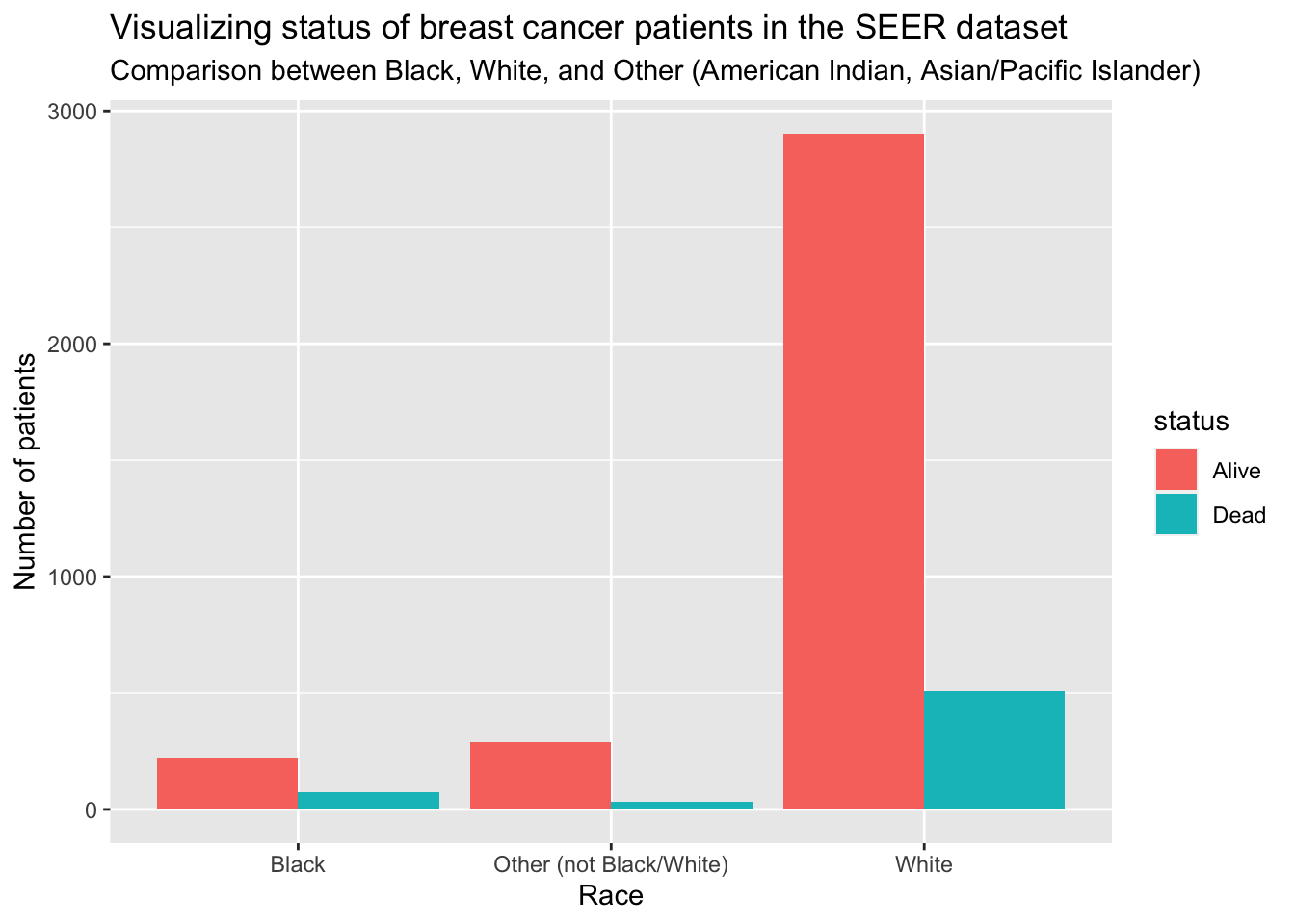
Creating a correlation matrix
I want to create a correlation matrix with the numeric values in the dataset (i.e., not classes)
bc_mod <- bc %>%
  select(age, tumor_size, regional_node_examined, regional_node_pos, survival_months)
Now, I will create the correlation matrix
Note
Quick refresher on how to interpret a correlation matrix:
-1 indicates a perfectly negative linear correlation between two variables
0 indicates no linear correlation between two variables
1 indicates a perfectly positive linear correlation between two variables
corr <- round(cor(bc_mod), 1)
corr
age tumor_size regional_node_examined regional_node_pos
age 1.0 -0.1 0.0 0.0
tumor_size -0.1 1.0 0.1 0.2
regional_node_examined 0.0 0.1 1.0 0.4
regional_node_pos 0.0 0.2 0.4 1.0
survival_months 0.0 -0.1 0.0 -0.1
survival_months
age 0.0
tumor_size -0.1
regional_node_examined 0.0
regional_node_pos -0.1
survival_months 1.0Visualizing the correlation matrix
ggcorrplot(corr, method = "circle")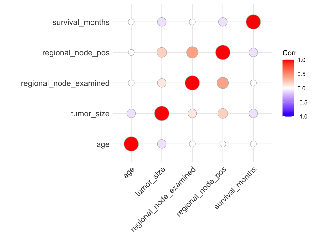
From the correlation visualization, we see a potential moderate positive correlation between regional_node_examined and regional_node_pos. However, from the data dictionary, this makes sense because regional_node_pos is dependent on regional_node_examined.
However, it seems as though there might be negative correlation between the following:
tumor_sizeandagetumor_sizeandsurvival_monthsregional_node_posandsurvival_months
Let’s explore one of those further.
Visualizing tumor_size and survival_months, grouped by race
Now, I want to see if there might be a causal relationship between tumor size and survival months, grouped by race. This relationship was highlighted in (Tanvetyanon et al. 2010).
g <- bc %>%
  mutate(race = recode(race, "Other (American Indian/AK Native, Asian/Pacific Islander)" = "Other (not Black/White)")) %>%
  group_by(race) %>%
  ggplot(aes(tumor_size, survival_months)) +
  geom_point() +
  facet_grid(rows = vars(race)) +
  labs(
    title = "Visualizing tumor size vs survival months",
    subtitle = "Grouped by race to look for differences",
    x = "Tumor size (in millimeters)",
    y = "Survival months"
  )

g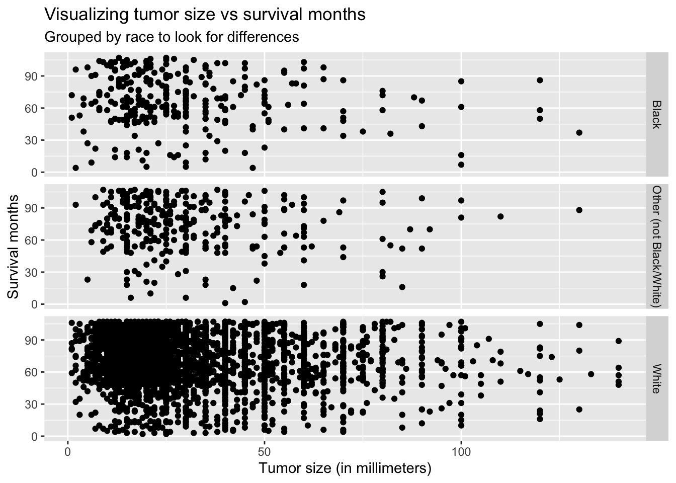
Thought not very noticeable, the graph above shows the slightly negative linear relationship between survival months and tumor size.
Summary and Conclusion
In conclusion, I started to look at the different features related to female patients with breast cancer. I also began to explore how race could play a part in looking for these differences.
Honestly, I know there is more I could do for this analysis. I intend to extend this project by creating and running a prediction algorithm to see how well I could predict status (alive/dead) based on the different features.
Thanks for reading!
Appendix
Below are the different functions I used from each of the packages.
From dplyr / tidyr:
rename()mutate_if()group_bysummarise()n()select()
From ggplot2:
geom_bar()facet_grid()geom_point()
References
Tanvetyanon, Tawee, Lary Robinson, K. Eric Sommers, Eric Haura, Jongphil Kim, Soner Altiok, and Gerold Bepler. 2010. “Relationship Between Tumor Size and Survival Among Patients with Resection of Multiple Synchronous Lung Cancers.” Journal of Thoracic Oncology 5 (7): 1018–24. https://doi.org/10.1097/JTO.0b013e3181dd0fb0.